Like anyone else who sells a popular product, Ancestry.com is always tweaking little things to improve the user’s experience. They’ve been working on some updates, some of which you may have noticed on the site over the summer and some of which are rolling out gradually over the next couple of weeks:
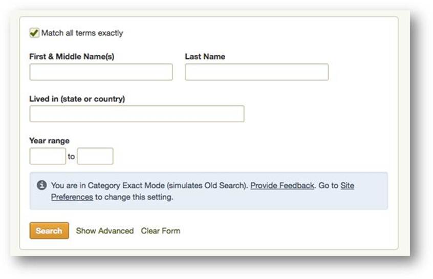
1. A simple search form with the check-box option to match all terms exactly.
2. Search results shown grouped by category. This is great–no more scrolling through lots of results when you’re looking for specific kinds of records. This sort feature also reminds us to check categories we may be overlooking, like city directories and local histories. These first two-features are opt-in: learn how to do it here and see what it looks like below:
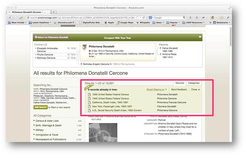
 3. A summary box at the top of search results showing what you’ve already attached to your ancestor. The list is sorted alpha-numerically so you can see easily which records have been found and where there might be gaps (see what it looks like below). You can collapse this list if you want to give you more room to see the search results.
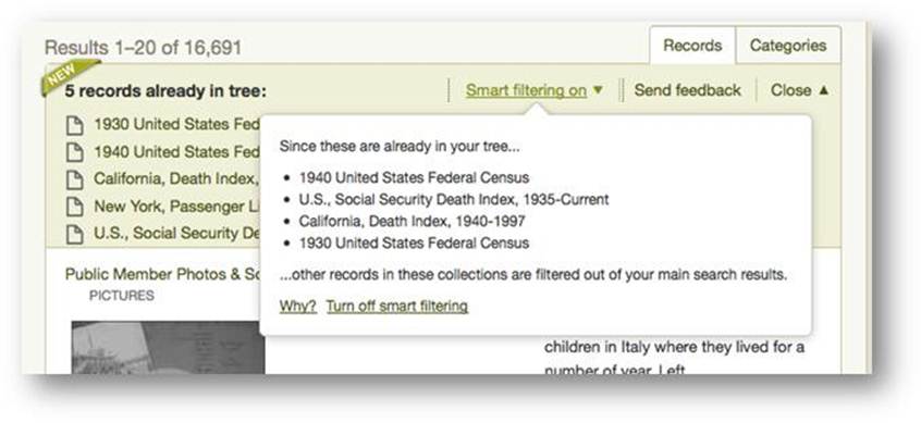
4. A filter that removes search results similar to types you already found for that ancestor. For example, if you already have a death record for someone, the filter will remove other death records. “Smart filtering” is an optional feature, so you can still choose to see the full list. Read more about it here and see it here:
 Ancestry says they will provide plenty of feedback opportunities for these new features. Don’t be shy: tell them what you like (and what you don’t) and why!


