History of the ENTIRE World on a Single Map?
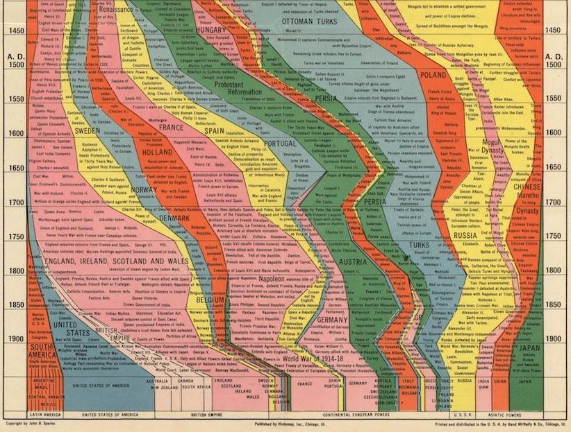
Partial image of Histomap of World History from Slate.com.
This might be the single most ambitious publication EVER: a chart that lays out the history of human civilization. It’s the ultimate infographic, created long before the era of the infographic!
What you see here is a partial image, a screenshot taken from a cool article on the 1931 Histomap: Four Thousand Years of World History.
It’s not perfectly accurate, it carries some cultural biases and ignorance of much of Africa’s rich history and the dates are given more as a range than anything. So what makes this a useful tool for genealogists?
We’re always looking for historical context: a way to understand how our ancestors fit into the “big picture” of history. Are you learning about a Portuguese or French line in your family? Learning by DNA tests that you have some deep Asian roots? Find these categories displayed on the map along with other dominant (or not-so-dominant) groups of your ancestor’s era. It’s cool to look at! Check out the entire map (and an explanatory post in this post by Rebecca Onion at Slate.com.
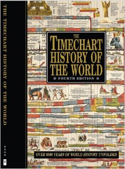 Genealogy Gems Contributing Editor Sunny Morton owns a book with a similar chart in it: Timechart History of the World (Timechart series)
The Timechart History of the World. The oversize, double-sided stiff cardboard pages fold out to more than 30 feet of full-color Victorian-decorated timecharts. She highly recommends it for the coffee table, if your coffee table is big enough to handle it!
Bonus: The Huffington Post has a neat article (with a photo) of another map from this series,The Histomap of Religion. (Time Chart of World Religion: A Histomap of Faith Through the Ages) Religions can be tough to trace forward over time, as various sects divide or merge. Every tool helps!